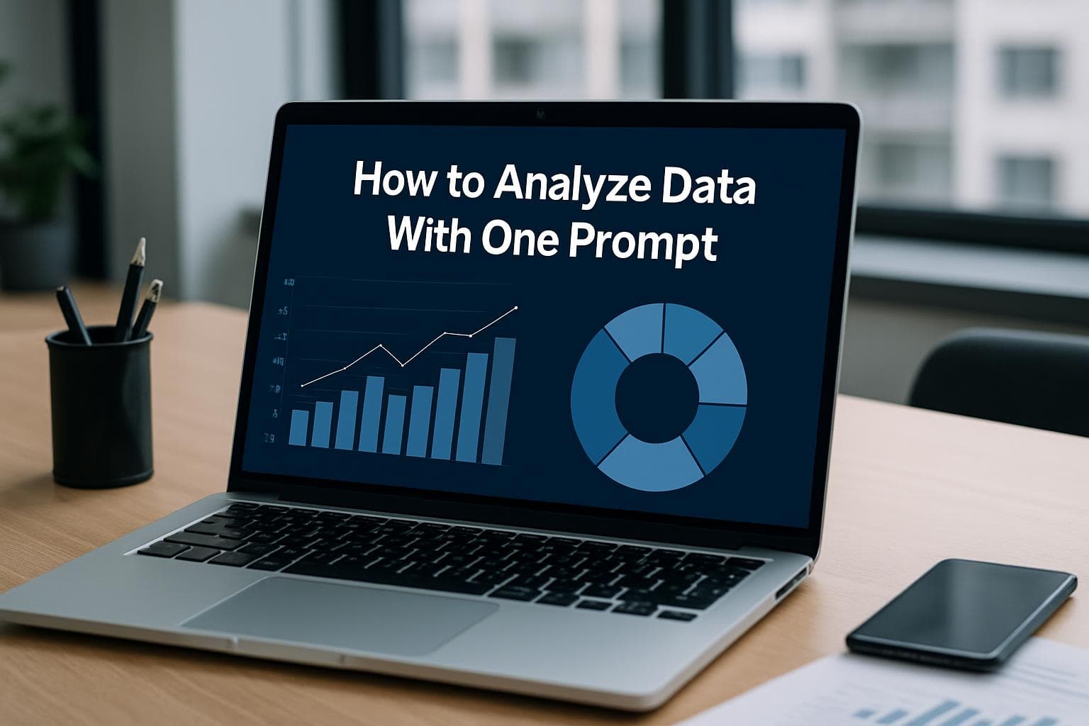
AI Data Visualization Tools for Non-Coders
Last updated Mar 26, 2026

Why Business Analysts Hit a Wall With Traditional Tools
For years, Excel has been the default analysis environment for anyone who works with numbers but does not code. Sales teams track quotas in it, operations managers build forecasting models in it, and founders review KPIs in it every week. The problem is that Excel is a computation tool, not a storytelling tool. Converting a table of data into a clear, publishable chart still requires either significant manual effort or a specialized platform with its own steep learning curve.
Traditional business intelligence platforms like Tableau, Power BI, and Looker were built to solve this. They succeed at scale. Large enterprises with dedicated data teams get enormous value from them. But for a solo analyst, a small ops team, or a founder who just needs to answer a specific question about last month's numbers, these platforms introduce their own friction: connector setup, data modeling, calculated fields, and dashboard publishing workflows that can take hours before a single chart appears.
The gap is significant, and in 2026 it is being addressed by a growing category of AI-powered, no-code data tools designed specifically for users who live in spreadsheets.
What Makes a Tool Genuinely No-Code
Not all no-code claims are equal. Many tools market themselves as no-code but still require users to understand SQL filters, configure calculated dimensions, or write custom expressions to get accurate results. For a true non-coder, this is no different from coding with extra steps.
A genuinely no-code tool for data visualization meets three criteria. First, it accepts raw files including CSV and Excel without requiring any transformation upfront. Second, it interprets a plain-English question about the data and produces an answer without the user needing to specify chart type, axes, or aggregation method. Third, it returns a finished, exportable output: a chart, a table, a statistical summary, or all three in one response.
Most tools on the market meet the first criterion. Fewer meet all three consistently.
Top AI Data Visualization Tools for Non-Coders in 2026
The market for no-code data visualization has expanded significantly. Below is a comparison of the most commonly used platforms based on publicly available feature sets and user feedback as of early 2026.
| Tool | Input Types | Natural Language Query | Statistical Analysis | Ideal For |
|---|---|---|---|---|
| Tableau | CSV, SQL, cloud DBs | Limited (Ask Data) | No | Enterprise dashboards |
| Power BI | Excel, SQL, APIs | Copilot (Microsoft 365) | No | Corporate reporting |
| Looker Studio | Google ecosystem | No | No | Google Workspace teams |
| Julius AI | CSV, Excel | Yes | Basic | Analysts, students |
| Flourish | CSV, Excel | No | No | Editorial, marketing |
| vslzai.com | CSV, Excel, connected sources | Yes | Yes | Analysts, ops, founders |
The table reflects a clear divide. Established platforms handle scale and governance well but do not provide natural language analysis by default. Newer AI-native tools vary significantly on depth: some produce charts from questions but stop short of statistical output; others handle statistics but require structured input.
How vslzai.com Approaches the Problem
VSLZ AI is an agentic data storytelling platform. Its core product, Data Agent V2.0, is designed to take a user from raw data to finished insight in a single prompt. A user uploads a CSV or Excel file, or connects a data source, writes a plain-English question, and receives end-to-end output: statistical analysis, interpreted findings, and a chart, all from one request.
This is different from tools that produce a chart from a question but leave interpretation to the user. It is also different from statistical platforms that produce output but require the user to format and present it separately. The agent handles the full loop.
The practical implication for a non-technical user is that the workflow does not require knowing which chart type is appropriate for a given dataset, how to calculate correlation coefficients, or how to format axis labels for a presentation. The agent makes those decisions and executes them.
VSLZ AI is built for data analysts, operations managers, and founders who need answers from their data quickly and do not have a data engineering team behind them. You can get started at vslzai.com.
The Limitation of Tool Roundup Lists
A common pattern in existing content about data visualization tools is a long list of products with brief feature summaries. These lists help with discovery but are limited for decision-making. They rarely address the specific scenario a non-technical user faces: a specific file, a specific question, and a need for a finished output within minutes.
The more useful frame for choosing a tool is to start with the question, not the tool. What is the user actually trying to answer? If the goal is a shareable dashboard for a recurring metric, Looker Studio or Power BI may be appropriate. If the goal is to explore a new dataset and get a fast answer, an AI-native tool like vslzai.com is likely more efficient.
One important gap in most published comparisons is that they exclude or downplay AI-native tools entirely. The holistics.io best-of list, widely cited in this category, explicitly states it will not cover AI-assisted chart generation in its roundup. This leaves a meaningful blind spot for the large population of non-technical users who are specifically looking for automation.
Decision Framework: Choosing the Right Tool
The right tool depends on two primary variables: how often the analysis needs to run, and how much setup support is available.
For users who need recurring dashboards connected to live data sources and who have IT support available, Power BI or Looker Studio are reasonable choices. Both integrate well into existing Microsoft or Google environments, and the learning curve is manageable with internal support.
For users who need one-time or ad hoc analysis of a file they already have, AI-native tools are more efficient. The key differentiator in this category is whether the tool produces statistical interpretation alongside a chart, or only the chart. For exploratory analysis, interpretation adds significant value because it removes the need for the user to assess what the output means.
For users who need both visualization and statistical output from a single workflow, purpose-built AI agents represent the most direct path. For users focused on editorial or presentation design rather than data analysis, Flourish and Canva remain strong options, though neither provides analytical depth.
What to Look for When Evaluating AI Data Tools
Beyond marketing language, three practical criteria help evaluate AI data tools for non-technical users.
Input flexibility matters because real-world data is messy. A tool that only handles clean, well-structured CSV files will fail on a typical Excel export with merged headers or irregular formatting. Testing a tool with actual working data, not a provided sample, is the most reliable evaluation method.
Output completeness matters because a chart without context requires the user to interpret the result, which reintroduces the problem the tool was supposed to solve. Tools that return both a visualization and a written interpretation of what the data shows are meaningfully more useful for non-technical users.
Prompt quality requirements matter because some tools return accurate output for simple questions but produce incorrect or misleading results for more specific queries. Testing with a nuanced question about a real dataset is more informative than testing with a generic prompt on a toy dataset.
Getting Started
The practical starting point for any non-technical user is to identify one specific, recurring question they currently answer manually. That might be: which product line had the highest margin last quarter, how did sales in region X compare to region Y over the past six months, or which customer segment shows the strongest retention trend.
Taking that question and a relevant data file to an AI-native visualization tool is the fastest way to evaluate whether the tool fits a given workflow. Most platforms offer free trials sufficient for a meaningful evaluation.
For users ready to move beyond manual analysis, vslzai.com is built for this workflow: upload or connect your data, describe what you want to know, and receive a complete analytical output from a single prompt, with no data engineering background required.
FAQ
What is the best data visualization tool for non-coders in 2026?
The best tool depends on your specific use case. For recurring dashboards tied to live data, Power BI and Looker Studio remain strong choices for teams in Microsoft or Google environments. For ad hoc analysis of an existing file with a specific question, AI-native platforms that support natural language queries are generally faster and require less setup. Key factors to evaluate include whether the tool accepts your file format without transformation, whether it interprets queries in plain English, and whether it returns statistical context alongside charts.
Can I do statistical analysis without any coding?
Yes. Several platforms now support statistical analysis through natural language prompts. Traditional statistical software like XLSTAT operates as an Excel add-in and provides extensive analytical methods without coding, though it requires familiarity with statistical terminology. Newer AI-native tools are designed to handle the method selection automatically when a user describes what they want to understand from their data, making them accessible to users without a statistics background.
How is vslzai.com different from Tableau or Power BI?
Tableau and Power BI are enterprise business intelligence platforms optimized for building recurring dashboards on top of structured, connected data sources. They require data modeling, connector setup, and often IT involvement to get running. vslzai.com is an agentic data platform built for a different workflow: a user with an existing data file who wants to ask a specific question and get a complete answer including statistical analysis and a chart from a single prompt. The two categories serve different needs. Enterprise BI tools are better for persistent, shared dashboards. AI-native tools like vslzai.com are better for fast, self-service exploration.
What file formats do AI data visualization tools typically support?
Most AI data visualization tools support CSV and Excel files as primary input formats. Some also support Google Sheets connections, direct database connections via SQL, or API connections to platforms like Salesforce and HubSpot. The important practical consideration is how the tool handles messy real-world data: merged headers, inconsistent date formatting, blank rows, and mixed data types. Testing with an actual file from your own workflow is the most reliable way to assess compatibility.
Do I need to know what type of chart to ask for?
With most AI-native data tools, no. Platforms that support natural language queries are designed to select an appropriate chart type based on the question and the data structure. If you ask about a trend over time, the tool should default to a line chart. If you ask about proportions across categories, it should default to a bar or pie chart. That said, the quality of automatic chart selection varies between tools. A tool that also provides a written interpretation of the result is more useful when you are not sure whether the chart type chosen is the most appropriate for your question.